Wearables
The health/wellness sector plus wearables are big industry buzzwords. Our user personas love to spend money on their pets. They are savvy with technology. No expense is spared when it comes to animal lovers. Instagram is filled with posts and photos of their beloved pet. Let's take look at the UX activities leading to app development.
UX Activities for Wearable Pet Device

Activity Tracker Dashboard
User research included heuristic evaluations of similar wearable devices and their companion mobile apps. Key features and positive findings included simple activity monitoring, wayfinding, personalization, health statistics, ease of use, syncing remotely, chip in collar, and alerts and notifications.
We developed a product that does these things: 1) activity and rest monitoring, 2) wireless sync (mobile app, collar and doggie door) + GPS, and 3) sharing and personalization based on breed, age and weight.

EMPATHY MAP
Happy Path & Sad Path Scenarios
THE DISCOVERY
The next phase after reviewing the competitive landscape delved into understanding our user's behaviors and mapping out how the experience would unfold. Basically, if the pet is healthy, the owner is happy. What if the app fails to detect a health problem? Another fail would be data not cumulating when battery dies.
The following workflow starts to plot out the onboarding process and the dashboard. Multiple pets were even considered and the ability to personalize with pictures of the owner's pet. This is where we start to identify gaps and overlaps.

Dashboard Workflow Diagrams

Design Studio Method
On your mark, get set, sketch. The design studio process is where a group of participants begin rapid prototyping to create and explore design alternatives before any high fidelity prototypes are built.
Next, the team clusters sketches for like concepts and begins to mashup ideas and organize similarities before round two. After the next round, team votes on the best ideas. Bono's Six Thinking Hats keeps the sketching on course and in that critical thinking mindset. Our pet activity tracker spawned initally from an idea for a pet sitter mobile app. Here's just a snapshot of what the two hour design studio process rendered.

RAPID PROTOTYPING SKETCHES
Welcome & Onboarding Screens
HIGH FIDELITY MOCKUPS
The sprint leads to design artifacts that can inform high fidelity mockups quicker and solves the real user problem. This is where my team member and I started to challenge ourselves to move past the usual iOS design patterns. Any seamless microinteractions to carry across Apple Watch and mobile devices? Large graphics and simplified UI are important for this user.
Here is the welcome page and initial onboarding walkthrough. Key features of app are revealed using engaging storytelling. During onboarding the user can opt out at any time by clicking on got it command. Interface is kept simple and minimalistic.

Usability Testing
Let's go into usability testing and why it is so important at any phase of product lifestyle. We had six participants who performed the blink test, initial impressions, task scenarios and the SUS survey. Participants were also asked to think out loud during testing. No one was familiar with our product. The main objective is to identify errors and difficulties faced by users in completing tasks.
Design vs. Use
The participants ranked the dashboard on a scale of 1 to 7 for layout/organization, look/visual appeal, and ways to navigate. At this stage of testing there is no clicking, just looking. We asked each participant if the dashboard met their expectations.
Impressions
Let's go into usability testing and why it is so important at any phase of product lifestyle. We had six participants who performed the blink test, initial impressions, task scenarios and the SUS survey. Participants were also asked to think out loud during testing. No one was familiar with our product. The main objective is to identify errors and difficulties faced by users in completing tasks.
Task Scenarios
Next, the participants were instructed to find an Australian Shepard's walking activity on specified date in the actual prototype. During the task, the participants expressed their concerns and talked through their actions. The epic fail for the prototype can be blamed on the side drawer navigation to filter the date. We did not want to clutter the dashboard with date filtering. A score of 4 is not ready for prime time. We have work to do in round two.


System Usability Scale (SUS) Results
The final test is ten questions ranking on a 5 point scale. (1=Strongly Disagree and 5=Strongly Agree) What's interesting with the recap is two participants were way down low on scale—20 and 32.5 respectively. Another two participants were on the high end at 87.5 and 82.5. Pulling the average to 60.
We can do better.
What exactly does a 60 mean? Basically, we're in marginable territory where the user would delete our app from their phone. At 75% we would be in acceptable range where user might refer us to a friend or say something nice on the app store.
The testing insights informed our next round of design and functionality for the app. Epic fail. This score is simply not good enough.

Fixing the bugs.

RECOMMENDATION #1
The activity stats did not make sense during the usability testing. Repeatedly this question kept popping up. "Why can't I see pet's heart rate here?" A common takeaway was the secondary stats seem like they should add up to the big number on screen.

Where Do I Go Now?
Another big callout during testing centered around the five icons on the dashboard. The chronological countdown plus a heart rate state seemed confusing and added some complexity to the dashboard.
Think about it—the active user is in the middle of his walk or run with dog on leash. The pet owner needs to be able to quickly scan the data.
The call to actions needed to be cleaned up to simple on word phrases visually identifiable with the icon adjacent to it.

Date Filtering
RECOMMENDATION #3
A big arrow on the right hand side of dashboard can be blamed for our usability testing fails. Once user clicks on arrow a slide drawer navigation slides in from right edge. We really wanted to keep the date filtering hidden to keep the dashboard visually uncluttered.
A hamburger menu icon probably should have been the visual navigation cue instead of arrow. Seems like a sliding date filter at top would be easy fix and still kept the dashboard design minimalistic.
It is argued in some UX circles that out of site equals out of mind. Sometimes having something hidden might not be the best course of action for the user engaging with app.
Stupid, Simple Please
MAKE THE NUMBERS ADD UP
During onboarding the pet owner answered a series of questions about his dog's breed, age and overall health. The API compares pet's numbers with similar breed to make recommendations for daily activity for walking, running and playing.
At a quick glance, the pet owner can track daily stats and filter activity by week and month as well. The numbers start to cumulate over time and build a database for the pet. Anything unusual is a trigger to visit the vet.
Alerts and notifications appear to motivate the pet owner. Time to check off the first fix.

Navigation Cleanup
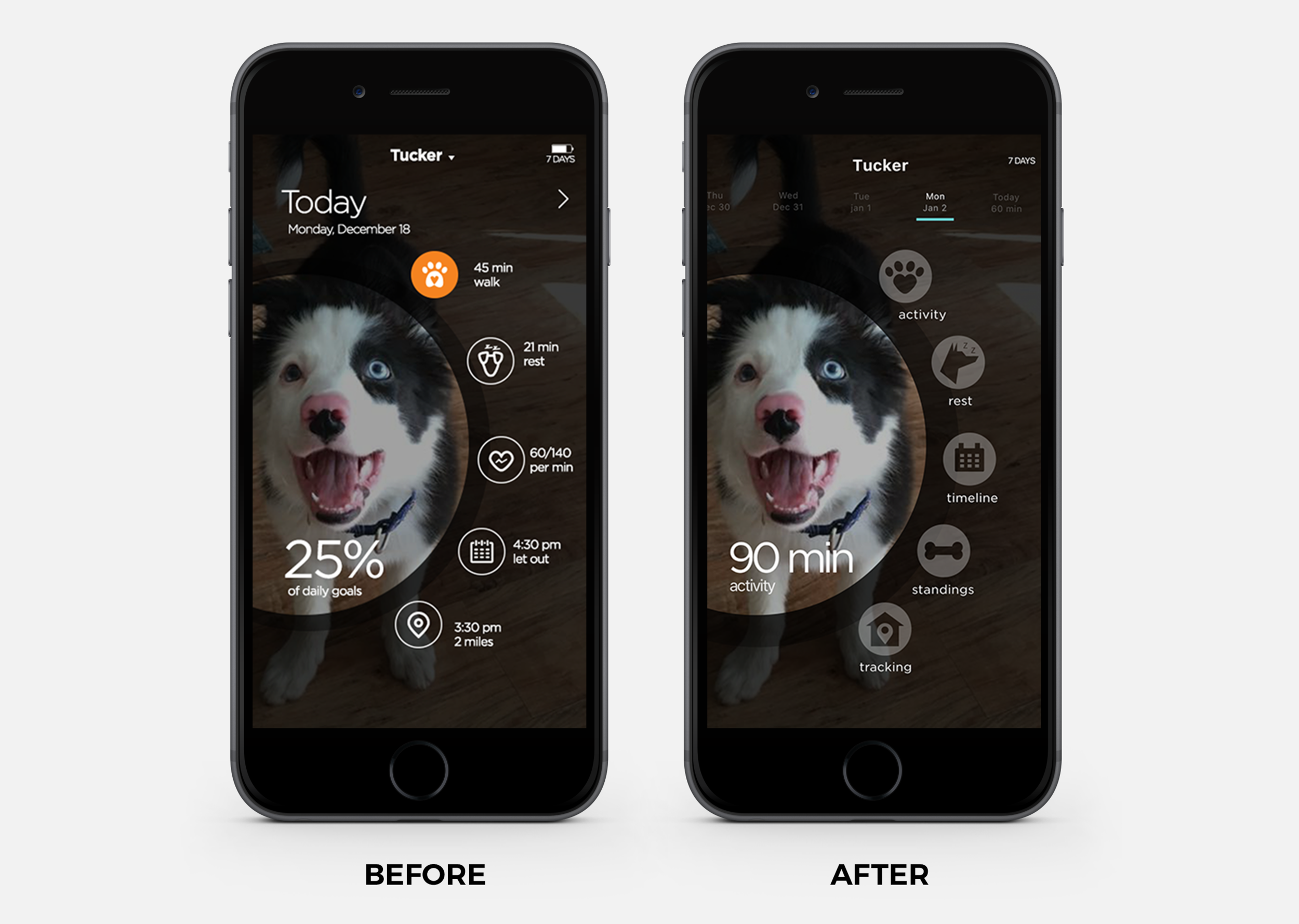
THE DASHBOARD REDESIGN
The biggest theme from usability testing centered around the confusing navigation. The linear icons did not seem to read as quickly as a solid fill might. Also, next to each icon there is a statistic. For example, 60/140 per min for the heart rate symbol did not register quickly in testing. "How do I know this is a good stat for my pet?"
Users kept trying to click on the big circle with 25% of daily goals. The dashboard iconography needed some clean up and more direct labels.
Walk + Run
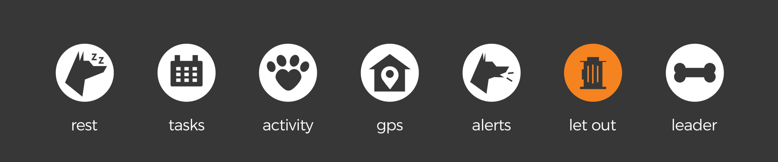
NEW ICONOGRAPHY SYSTEM
Now, we need to decide which functions are the most important for the pet owner to filter. Overall, as a pet owner, I would want to know how close I am to meeting my daily goals. After more research and competitive analysis of other pet trackers, we narrowed down the five icons for the dashboard.
The new labels are activity, rest, timeline, standings and tracking. The newly redesigned minimalistic iconography registers quicker for pet owner on the go. The icon system is adaptive for Apple Watch too.
Natural thumb patterns were considered for the circular arrangement of icons on the dashboard. The diagram below shows placement of labels work for all three thumb zones. This very important with a dog on a leash in one hand and the user balancing phone in another hand.

Hollow vs. Solid Icons
NEW ICON DESIGN SYSTEM
What is the best affordance in this case? This could really be an assumption without a round of AB testing to see how long it really takes user to interpret. In our usability testing the icons and label are really what caused the confusion. By clearly labeling the solid icon we are making it unambiguous. We also had a little fun with the icons. The symbol for the smart doggy door is a fire hydrant.

Show Me the Numbers
The final cleanup from our usability testing is the filtering activity by date. The slide drawer date filter is now replaced with a simple microinteraction showing day of week and month. A bar hovers over the date for user to click to reveal activity screen with stats and goals.
This simple modification keeps the dashboard visually uncluttered, yet gives our user the ability to access data with fewer clicks..